|
Notes
from the Editorial Team
|
| At the American
Hosta Society National Convention of 2010, held in Bloomington, MN, the
society’s leadership determined that there was a need for a new form of
publication, resulting in The Online
Journal. A group of seven individuals with ample talent,
skills, and
creativity made a commitment to the project. I had the good fortune of
being a
part of that initial team, growing and learning along the way. It has
been
filled with rewarding experiences, through which I have met many new
people and
have forged closer relationships with several others, due to their
willingness
to contribute to the OLJ. The
personnel and structure of the team have changed. However, the
commitment to
quality has not changed, nor has the team concept.
I
have accepted the role of President for the
society and wish to introduce the new editor for the Online
Journal. I first met my replacement at a regional meeting on
a social basis, talking hosta, of course. He
captured my attention through subsequent conversations and my receiving a local
society’s newsletter, Hosta Horizons, which is produced for the Russ
O’Harra Hosta Society (ROHS). For the twentieth anniversary of ROHS in 2013,
Reldon Ramsey produced a booklet of fifty-plus pages, replete with articles and
photographs, which has garnered high praise from those who have served the AHS
as editors.
I am confident
that you will find that Reldon Ramsey will continue the tradition of
every
member of the Online Journal team
with the same degree of commitment, resulting in a high quality OLJ as we move into the future.
In service,
Don Dean, Editor

|
|
| | | |
A New Editor’s Welcome
I am pleased to have been asked to join the Online Journal Team as Editor. I have
been assisting Don Dean and the OLJ Team
with this issue and have benefited from his patient guidance.
The first three issues of the Online Journal have set the bar high. As editor, I will strive to
maintain the standard set by all of those who have previously been involved.
The Online Journal
Editorial Staff is comprised of nine dedicated individuals. I look forward to
working with each of them in the future, along with Vice President
Publications, Barb Schroeder. Don Dean will continue to share his experience as
my mentor.
You will find that the focus of the 2013 Online Journal, as always, is coverage
of this year’s AHS Convention held in Milwaukee, along with regional activities.
This OLJ contains a wealth of other
interesting and informative articles, as well. I’d like to draw your attention
to several in particular: Tobacco Streak Virus (HERE); the final report of the
AHS Commission on the origins of Paul Aden registrations (HERE); new
membership options and an update on Nematode Research (HERE). Get acquainted with the
new members of the AHS Board (HERE). Please take a moment to respond to the
survey of AHS members to help build the society (HERE).
The
first issue of the OLJ, which debuted
in 2010, remains available to both AHS members and the public. On the AHS
Homepage, select “AHS Publications” under the "Literature” heading in the
left margin. Other past issues remain accessible in the Members area of the
website. On the left margin, select “Archive” under The Online Journal.
Please
keep your Email address current with Membership Secretary, Sandie Markland. If
you haven’t done so already, be sure to sign up with Josh Spece on the AHS
website for current information and happenings within the AHS via the E-Newsletter,
which is sent quarterly.
I am excited to begin work on the Online Journal for 2014. Please contact me if you have an idea for
an article or would like to contribute by writing an article. Photos of hosta
cultivars, AHS convention gardens, and especially regional events are always
needed. We appreciate everyone who shares their photos.
Our
team hopes you enjoy the fourth issue of the Online Journal.
Reldon Ramsey, Editor
| | | |
|
From
the Style Editor:
By any
reckoning our first two editions of the Online Hosta Journal were
successful, providing
our membership a wide variety of topics related to the Genus Hosta. Real accounts of significant
hosta experiences
were truly inspiring, while the garden reviews and personal interviews
rewarded
positive effort. We
have continued our
quest to provide an array of stimulating articles and stories for our
followers.
|
|
 |
|
| Editing
for this Online Journal has been, and will be, kept to a minimum,
preserving
the intent of the author as our primary focus. There
will be no drastic rewrites. The
main editing focus will be on grammar, spelling,
usage, and lucidity. Our
purpose is to
guide our contributors in expressing their perceptions in an
interesting
manner. Any editing
is done to enhance
the piece, not to rewrite it. We
also intend
to recognize the varieties of regional expressions practiced around our
country
to retain local flavor. In
addition, any
speeches presented will be printed as submitted. We
truly appreciate your submissions on a wide
range of topics that proved interesting and provocative to our readers.
Since
learning is constant, we are certain there are experiences to relate
and new ideas
to share. Everything
will be read and
considered for inclusion in the 2013 Online Hosta Journal. Our editors are committed to
offering entertaining,
as well as educational material.
Marcia
Sully, Editor
|
|
| |
|
From
the Photo Editor:
As many of you
are aware, and per Tom Micheletti’s article, the Wisconsin Convention
this year
was a different format. Driving to each garden gave us the opportunity
to have
more time visiting with the owner and spend more time viewing the
garden while
not being pressured by the “whistle” to head to the bus. I remember one
convention where they had to shorten our time in the garden because we
were
behind schedule
However, the
change seemed to reflect in the photos received for our 2013 garden
visit. Some
people did not make it to all the gardens on both days. We spent more
time in
one garden and, due to weather and needing to get back to the hotel for
activities we were involved in, required us to, unfortunately, miss a
couple of
gardens. Thus, I had to rely on others to furnish the photos and this
presented
some challenges.
One feature this
year that did help was that the author of the write-up for the
garden sent photos.
Wow, this really helped. Each year, I try to match photos of hostas and
other
garden features to the description of the garden. This time, one of the
writers
sent the photos and, when I followed the story, the photos matched.
What a
relief for picking the right photos. Some of the other writers sent
photos,
and, with those I had from other attendees, it became a simple task to
match
photos and article. However, as always, the writer will mention eight
to
fifteen hostas and everyone furnished eight to fifteen photos, but none
were
matches.
As in past
years, I also received hosta photos with no hosta name on the photo or
plant
name photo preceding the photo. In
some
cases, the garden owner can be contacted, sent a photo, and asked for
identification of the hosta or plant. It is a great help if the name(s)
of the
plant(s) in a photo is/are included with the accompanying photos. This
year, we
were also lacking in “convention photos” and those of outside
activities, such
as sites advertised by the Tom and Jack convention committee. I would
like to
say that Randy Goodwin does a great job tagging each photo the he
submits,
along with those of Steve Cunningham.
Remember, we are
always looking for a cover shot (vertical photo) or a centerfold shot
(horizontal), so plan early in the year and send those photos you just
took or
the one from last year. See you in Iowa.
Rick Schroeder,
Photo Editor
|
|
| | | |
Take a
Close Look Back
Cover Contest
| | |
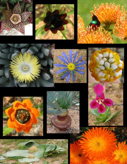
You will notice
a link to the back cover on the Contents page this year. We’ve decided to hold a little contest,
culminating at the 2014 National Convention in Cedar Rapids.
The rules are
quite simple: Identify the pictured
plants from their flowers, and then tell us which ones are related to the genus
Hosta. (Details on the back cover.)
Submit your
entry on or before June 1, 2014.
Mail to:
Floyd Rogers
22W213 Glen
Valley Drive
Glen Ellyn,
IL 60137
| |  | |
|
|
|
We had several choices in how we would design The
Online Hosta Journal. We could take the familiar PDF route;
we could design it like a website along the lines of Time magazine's
site, or we could try something a little different.
What
we came up with is essentially a website in
structure, yet one designed to look and feel as much like a paper
magazine as possible, while still retaining the quick loading and easy
functionality of a website. In effect, we tried to create a hybrid
between a magazine and a website - one that featured the best features
of both. A percentage of our members still have dial-up, so we needed
quick loading times.
|
|
 |
| |
To get the look we were
after, pages were constructed in HTML, using tables to simulate a
magazine-like layout. With HTML pages of this kind, the browsers exert
quite a bit of control that we cannot override. In particular, they
exert control over text size, but they also handle table instructions
differently. This means that the Online Journal pages will look a
little different, depending on which browser is being used. We have
tested in the four most common browsers - Internet Explorer, Firefox,
Chrome, and Safari, to try to reach a balance of good appearance in
each. The way each browser changes the text will cause some to see
extra white (empty) space, where others see more tightly laid-out
pages. In general, the best appearance will be either in Firefox or in
Internet Explorer, as they are still the most commonly used browsers.
We chose the Georgia font for the bulk of the text
because it displays well in all browsers and is large and easily
readable in 12 point size. Some have large monitors with high
resolutions, and to them the Online Journal may
take up only a small area of the screen. We recommend that people
seeing a too-small version either change resolution to a more common
setting, or that they use the browser controls to magnify the whole
page. If the browser settings are used to magnify text alone, it can
really make a mess out of the page, causing text to overlap and other
undesirable things. |
|
